In the true spirit of christmas, I will share some cool tricks on how to get deeper into Power BI.
My good friend and collegue Henrik Hoe started out by showing a little bit on how to get started with Power BI, I will extend upon that and show you how easily create a live view of SCCM inventory data.
First of all, we need to have Power BI Dekstop installed. For easy access to my SCCM database I installed it on my SCCM Primary Site (it is a test environment so that okay, but normally you would not do that of cause)
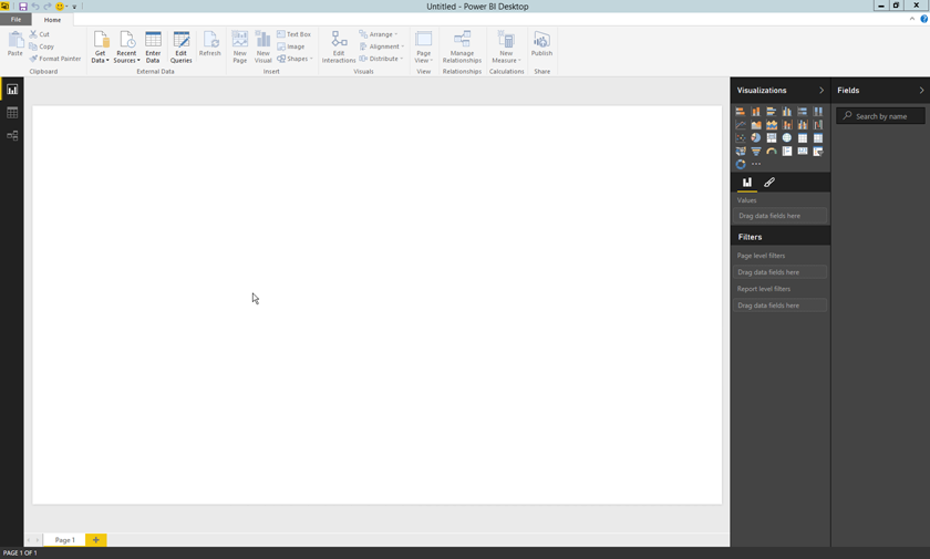
So fire up the Power BI Desktop app
Setup a data connection
In order to connect to the data, we need to either connect to the database and select what views and tables we like to include, or we can make a query that gets the data we need.
For this example, I decided to build a SQL query in order to keep things relatively simple.
SELECT
S.ResourceID,
S.Name0 as Name,
S.Client_Version0 as
Version,
OS.Caption0 as [Operating System],
CS.Manufacturer0 as Manufacturer,
CS.Model0 as Model,
PB.SMBIOSBIOSVersion0 as BIOS,
PR.Name0 as CPU,
SUM(PM.Capacity0)
as Memory,
SUM(LD.Size0)
as [Disc Size],
SUM(LD.FreeSpace0)
as [Disc Free]
FROM
v_R_System S
join v_GS_OPERATING_SYSTEM OS on S.ResourceID = OS.ResourceID
join v_GS_PHYSICAL_MEMORY PM on S.ResourceID = PM.ResourceID
join v_GS_COMPUTER_SYSTEM CS on S.ResourceID = CS.ResourceID
join v_GS_LOGICAL_DISK LD on S.ResourceID = LD.ResourceID
join v_GS_PC_BIOS PB on S.ResourceID = PB.ResourceID
join v_GS_PROCESSOR PR on S.ResourceID = PR.ResourceID
WHERE LD.DeviceID0 =
‘C:’
GROUP
BY S.ResourceID, S.Name0, S.Client_Version0, OS.Caption0, CS.Manufacturer0, CS.Model0, PB.SMBIOSBIOSVersion0, PR.Name0
The query pulls data from SCCM inventory and lays it out nicely for each System Resource
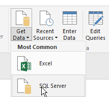
In Power BI, click the Get Data dropdown and select SQL Server
This brings up the SQL Server Datbase dialog where you can specify the name of the server and the database, please expand the SQL statement (optional) area
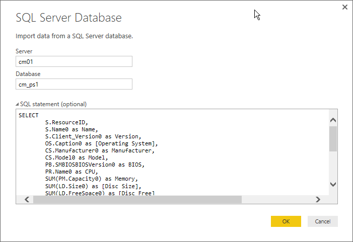
As you can see I pasted in my SQL Query in the lower text area.
Click OK to see a preview of your data.
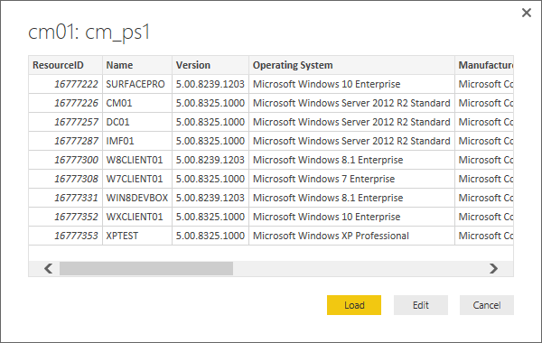
Now click Load and select what type of connection you want, in this case we go with a DirectQuery.
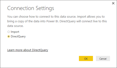
Click OK one last time, and wait for Power BI to setup the connection.
Prepare the data query
Depending on how you connect to your data, you may need to do some clean-up or adjustments to your data before using it, table and column names can sometimes be strange and not so readable, but you can rename, reorder and change a lot of these to make things look better.
The query that I have used, is pretty much ready to go with column names and such, but one thing I like to do is to rename the Query, as Power BI just calls it Query1.
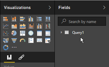
Go ahead and right-click Query1 and rename it to something better. I went with SCCM Clients
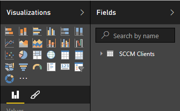
Now expand the Query to reveal the data that we can play with.
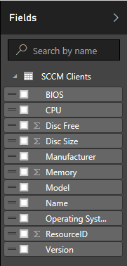
Build some visualizations
To build the first visualization just drag the Operating System row onto the Power BI surface and drop it in a suitable place
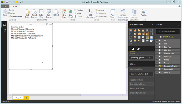
This gives us a rather boring table view of the different Operating Systems we have registered for clients in SCCM, but let’s beef it up a notch.
Drag the ResourceID row to the table and see how Power BI adds a count column to the table, which still quite boring.
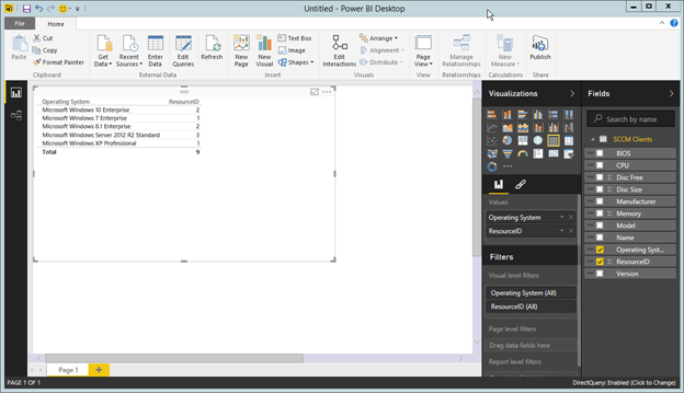
Now for the fun part, with the table selected, click the Stacked Bar Chart  icon and see what happens.
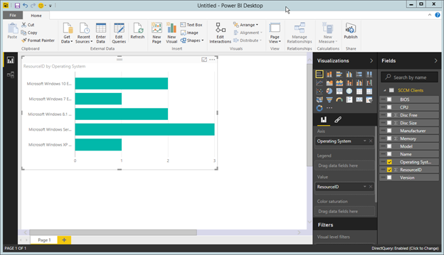
Try some of the different chart forms to see what suits you and your data the best.
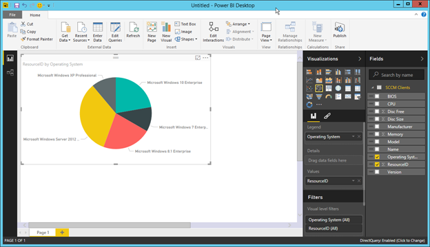
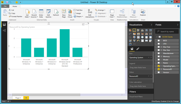
I decided to go with this one.
For the next visualization we need the Version row and the ResourceID row, now transform that into a nice Donut char
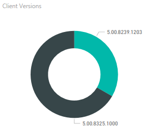
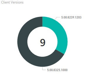
To spice it up a little, drag the ResourceID row onto the surface to create one more Visualization, and make this one a Card
Resize it and drag it over the Donut chart we made earlier to create and nice total count. (I removed the category label in my sample).
The final result looks like this
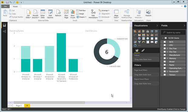
Introducing Slicers
Some people will maybe say that all of this could be done in Excel, and yes it can, but Power BI has a very cool feature, that I have not yet seen in Excel (I’m no expert on Excel at all).
Slicers is where Power BI really takes off when you look over your data.
Lets add a slicer to our chart.
Drag out the Manufacturer row into the Power BI surface and drop it in a free area.
Again we get the not-so-cool table
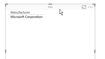
Select the Slicer icon  to change the table to a slicer
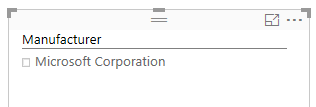
Now the table has a checkbox.
Let’s add another one, drag the Model row to a free area, and again change the table into a slicer.

Power BI has already connected the two slicers with all the other Visualizations on the page, so when you check or uncheck the boxes, it filters the data all over the page.
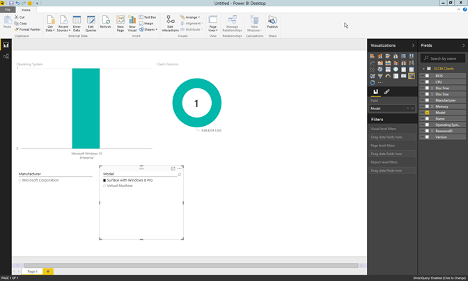
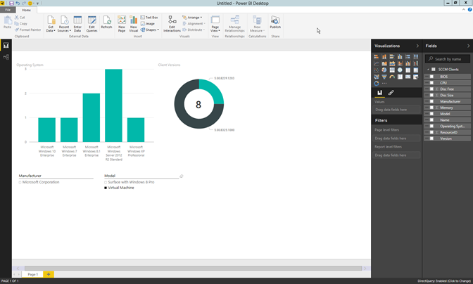
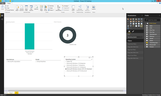
I added another slicer to filter on Operating Systems also.
Well that’s it for this little dive into Power BI, hope you enjoyed it.
To all a very merry XMAS (what-ever-you-call-it) and a happy year

[…] As you can see, this is a powerful new way to look at data. Get started today by heading over to powerbi.microsoft.com and be sure to check out Ronnie Jakobsen’s post, of Coretech, on Hardware overview with Power BI. […]
What’ѕ up, I read ykur bloys likee every weeҝ.
Yourr story-telling style is witty, kee up the good work!
My blog – Pokecoins Generator (Schinkelwoau92.Deviantart.Com)