Do you know the feeling when it feels like you have lost your head and can’t find the information your need? You start browsing the 468 canned reports and quickly spend a couple of hours still without finding exactly what you need.
@ Coretech we know the feeling, but instead of keep being frustrated we decided to do something about it. Our solution is a System Center 2012 dashboard where we can see all the information we need in an easy way. Our dashboard will provide you with information in 3 layers and 3 dimensions….it sounds smart and Yes, it is smart.
The three layers
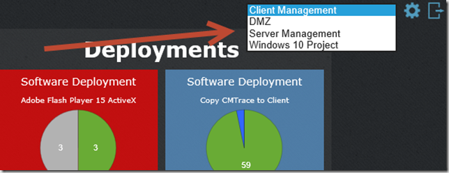
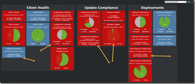
The three layers of easy accessible information is Views, Groups and Widgets. A View is a logical grouping of objects that you want to present. In this example I have 4 different views; Client Management, Server Management, my DMZ environment and information about a worldwide Windows 10 project. Access to creating and reading information from each view can be controlled by traditionally user and group access.
The Group is a child object of a View, again it’s a logical grouping of information that’s represents a business value. In this example I have my Client Management view, where I have decided to divide the information into Client Health, Client Compliance and Deployments. Within each group there is one or more Widgets. The widget provide me with valuable data from my ConfigMgr environment. I the below example I have highlighted a few examples like; How many Antivirus engine versions do we have in the environment? Are all clients accessible and working? What is our current software update compliance level for a specific collection? And finally what is the status of all Windows 8.1 task sequence deployments? And what is our average installation time?
The three dimensions
The dashboard also offers you three dimensions of information, where each dimension will reveal more and more information enabling you to answer all the “why questions”, and look like the smart person we all know you are. First dimension is the dashboard itself, it’s here you find the overview but also here you will be met with all the “why questions” like; Why are we not 100% compliant?
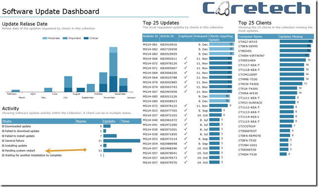
To answer the questions you need to drill into the second dimension – our dashboard reports. In the example below, I’ve clicked the Software Update widget for a specific collection. This takes me to our Software Update Dashboard report, where I’m presented with a more detailed overview. With the information presented to me I begin to understand why our compliance level is not better. Notice the information about machines in pending system restart mode, the top 25 updates required and the top 25 clients. With information like this you can start answering the “why questions”.
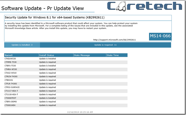
Next step in the road towards “acceptable compliance” is to do something about the problem. For some organizations it means implementing a workstation restart policy, for others it’s a simple question of fixing the issues. Fixing the issues is often a job for service desk, and this is where the third dimension comes into play. All the dashboard reports will allow you to drill into more detailed information about the issue. In this example I have clicked on the Top 25 update MS14-066 (a zero day exploit from November). This will provide me with a list of computers that I can hand over to service desk and let them fix the issue and make me look smart.
I wish you all a Merry Christmas and let’s make 2015 the year where we all look smart again – for more information http://www.coretech.dk/dashboard


Hey,
I would like to test your configmgr Dashboard. Could you please provide me a Link to download it?
Thanks,
Luka
Hello, could I get your dashboard, or it need payment?
Hi Alexandr,
You can request a 14 day trial from this page: http://coretech.global/downloads/sccm-dashboard/
Best Regards,
Casper
Is this still available?